TL;DR: It’s hard to say. I don’t think there’s a game which style I could name a 100% reference.
At first I had a vision of something along the lines of Stonehearth style, something that can be made by a non-artist (so-called programmers art):
https://stonehearth.net/wordpress/wp-content/uploads/2013/03/farm.jpg
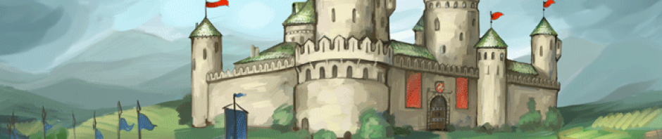
Stonehearth is nice in its clear shapes, clean colors, nice ambient lighting. The plan was to have at least this far to get the NG going. As you can see – NG terrain has this style, although not as rectangular. Still Minecraft style houses are much too weird IMO, so the first NG houses were more vector-style like, with no textures in mind (Fisherman`s, Sawmill).
Through time I have collected many examples in my references folder, they all revolve around bright clean colors, cartoonish style, a bit schematic design. For recent example (yet unreachable) I find this Brewery absolutely gorgeous:
For the houses I’ve got some new experience with freelance artists and now that brewery style seems more tempting to try to achieve. It’s hard to find the right man for the job and price though, so I’ve got to get my hands dirty in texture painting and I kind of liked it. It comes out pretty nice and different from the Brewery example (cos that might be too contrast for a whole game to have). Let me finish the Sawmill and I’ll post it.
As for the level of graphics (that is purely technical side, art aside) – I’m going for 3D with a locked camera (you can only zoom in and zoom out). All modern 3D RTS games graphics are kind of similar. I guess 0A.D. kind of graphics is nice, clean, with some special effects, yet no overkill bloom, no blur.
Questions and suggestions are welcome 🙂
I’m glad you dropped the Stonehearth-style idea. Way too blocky for a game like KaM (and NG for that matter). The brewery looks indeed very, very nice. However, a game full of buildings and surroundings with such cartoonish style and so much colour don’t work for me. I just can’t take such games seriously. An example of this is Red Alert 3. Look at these screenshots: http://s.pro-gmedia.com/videogamer/media/images/xbox360/red_alert_3/screens/red_alert_3_31.jpg and http://megagames.com/sites/default/files/game-content-images/Red%20Alert%203_1%202.jpg
Apart from these ridiculous units, all buildings have just too much colour. Especially on the second screenshot, those units and buildings don’t fit with the nice surroundings and especially the cottage in the top right. It hurts my eyes.
For comparison: C&C 3: http://www.ryansgoblog.com/images/cnc3_gdi_base.jpg
With graphics similar to 0 A.D. no one can complain though, imo you should aim for something like that. 🙂
Thanks for response and examples! 🙂
Speaking of visuals – Red Alert indeed looks over-saturated, no doubt about that. But I guess that if saturation is reduced by half and some of the red areas removed then it will be quite okay color-wise. Also reducing contrast in shadows would help IMO, cos they are too “damp”. Of course RA developers know what and why they are doing, they have much more experience and data to aim their target audience. With NG I’m just doing it for target audience of myself hoping that others will like it too 🙂
Funny thing though, is that I don’t have a full picture of NG yet, I’m barely approaching it from many sides – terrain, atmosphere, water, houses, objects, units, gui, icons … everything is wip 😉
Hello,
first at all..I wasn’t active in the Forums for the last years…but I always followed your work to see how far it goes. I’m glad you made it in the end to make it possible to play multiplayer matches online with people all over the world. Great work – Respect!!!
What do you think to make the final ingame graphics on Knights Province to look similar to the ones from Settlers 4? (original name: Die Siedler 4)
To me, those was the best Settlers game and the graphics where good enough to play on random pc’s with a low price graphic card. And they still look great.
http://2.bp.blogspot.com/-uJgl7Ozg2tY/U7rjOx011SI/AAAAAAAAI88/UDQfA-ut07Y/s1600/siedler4_shnuffy.jpg
http://images.cgames.de/images/idgwpgsgp/bdb/1023068/944×531.jpg
Greetings from Germany!
Hi,
I find Settlers 4 graphics much too contrast, I’m hoping to reach for something similar to Age Of Empires Online – graphics there are more “calm”.
Thanks for writing! 🙂
Did you played the game Firewatch ?
http://store.steampowered.com/app/383870/
Maybe you’like the style.
This is a nice game, I have watched about it on YouTube.
Graphics-wise it looks okay.
P.S. Edited your comment to include the game’s title.
its 2017 and (from the media: developer page) the look you have settled on is nice, if somewhat squat (dwarf-ish), looks good. (all your references are 404’d)
Would it be possible for you to release some spec’s for formats etc, just in case someone feels like modding KP?
Cheers
Format (just like the game itself) is not settled yet.
For the future – yes, that would be a nice thing to have )
I like the graphics of the brewery very much
But I would rather make it more into reality so it was not such a child.
And I would like to see how the landscape and soldiers will look like in the final version
have a preview?
Thank you
Hi!
I am very glad to see the someone who has inspired by K&M like I was, because of other my friends did not like this game at all 😀
But I think a units and buildings sizes are too large in the current alpha. They looks like zoom +10 in comparison with K&M original 😀
Do you have a thoughts to set a sizes of content smaller or you like it this way?
Hi,
I do have some doubts about house/unit sizes. Maybe 10% smaller could be better.
You can actually playtest that – open F11 menu and on top you will see 2 sliders for unit/house size change.