Here I’ll try to explain how icons are being made for NG and why they are being made this way.

Without argue, best icons are pixel-art. Every pixel is hand-crafted, they look gorgeous. However they have a few problems that come along. Firstly they require immense amount of skill and time to create – every single pixel matters. Secondly they are hard to tweak, e.g. making an object slightly different shaped requires to redraw all connected pixels. And thirdly, it’s hard to achieve certain curve shape without tweaking each of it’s pixels, thus missing the forest behind the trees.
To let the creativity flow – there’s raster painting. Raster painting is good for images with lot’s of detail that don’t need perfect precision. The technique allows to draw with wide strokes, sketching the shape and adding details to it on demand. In the older days I tried drawing some icons using graphics tablet. Basically I took the reference image and tried to draw it as closely as possible in a larger scale (x10). Such big scale is required to draw fine details that are less than or around single pixels size.
Such raster icons have a number of drawback as well. Firstly it is hard to maintain uniformity in details (for example outline width) across the single image and across many images. Then there’s problem with tweaking. Global color tints are easy to change, but individual colors are hard, elements layout and proportions are very hard, because that basically requires to redraw all affected parts. And as you can see on images above, they are came out vector-like.
Another approach, which I’m going on with now, is to draw icons in vector and only then rasterize them. This is akin to raster drawing, but there’s no that “freedom” in laying out strokes. However on the other hand vector illustrations are easier to edit and to keep outlines uniform width. This way I can tweak both big shapes and small details selectively.
Illustrations are drawn in big scale with points snapped to grid, so there are no unwanted seams between contours. All-in-all it’s much alike pixel-art, but with pixels replaced with vectors 🙂
- To make an icon I start off with googling for a reference image
- Crop and scale image to size, checking that details are distinct
- Create an outline with 0.1px black line
- Create areas of color, aligned with outline shape, so there are no overhangs
- Add smaller details
- Cleanup, tuning colors
- Export raster sample to see how it looks in final size (32x32px)
- Tweak details and colors to add contrast where needed
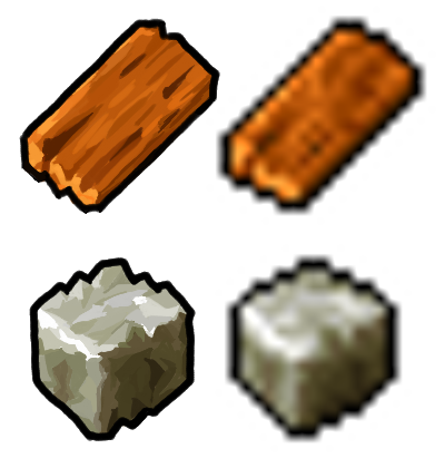
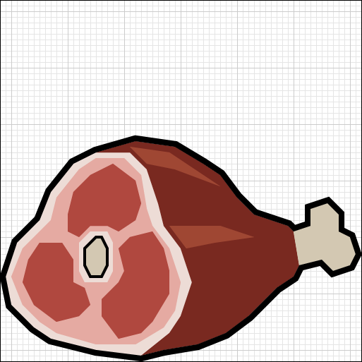
This is how it looks in game scale (32x32px):
![]()
![]()
Some icons are nicer, some are raw – everything is a placeholder. For now there’s no goal at making the icons perfect – there are bigger issues to solve.
P.S. As always – comments are welcome!
I like the fish and the meat 😀
The raw materials are indeed a bit raw. 😉
Sometimes it would be nice if you can mention the programs you use or giving examples wich-use-to in this case:
Vectordraw:
Adobe Illustrator (?)
Rasterdraw:
Windows Paint
Late Post cause reading your Blog from begining…encountered project just few days ago.
Hi, I often don’t mention the tools, because they really don’t matter that much. Given the technique, it can be applied in different tools. Use whatever you are comfortable with, can afford and can import/export to your project!